
This is the latest in a series of blogs exploring the use of social media in public health and healthcare. The blogs have used social network analysis to study awareness raising campaigns (#VaccinesWork, National Clean Air Day, Antibiotic Awareness Week 2016), conferences (European Public Health conference 2016, Quality2017), and key influencers (exploring whether the 85:3% rule applies to tweeting about health and healthcare).
You can also read and download the blog in a PDF.
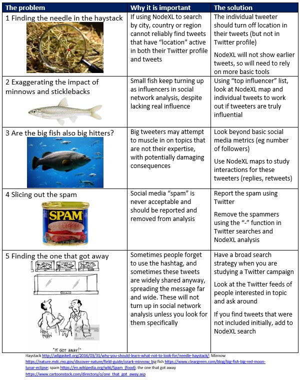
This blog attempts to share some key methodological pitfalls in planning, conducting and sharing the results of a social network analysis. It is structured around 5 main ideas:
- Finding a needle in a haystack
- Filtering out the minnows and sticklebacks
- Working out the size of pond for the big fish
- Slicing out the spam
- The ones that got away – and how to include them in the final analysis
The work has reminded me of work on cell culture when I was a medical student: I worked in a lab in Dallas, Texas, for 4 months November 1994-February 1995, studying adrenal tumour cells. This was my first time working abroad, and I was a little star struck, working in Parkland Hospital, famous as the hospital that treated JFK on 22 November 1963, and home to Nobel Prize winners including Alfred Gilman. My research did not reach such heights. Results were disappointing and unpredictable, week after week, and I was running out of time. Research is marked as much by its “failures” as its “successes”; both are an essential part of learning, though the stumbles are shared less than the leaps forward.
Cell culture, like social network analysis, requires the right conditions: for cell culture this includes temperature, nutrients and preventing the build up of toxins. The scientist plays a crucial role: processing and plating the cells, changing the culture medium without sucking up the cells or drying them out, studying the response to different reagents. Measures include the appearance of the cells, and assays measuring stress hormones. My results showed either no response, or a huge spike in these hormones. Changing the conditions made no clear difference. We only found an answer to the question when we looked at the problem using two different approaches: measuring the stress hormones as usual, but also looking at the cells down a microscope. The “spike” I had observed on a few occasions was not a sign of a rigorous response, but cells in their death throes, spilling out their contents. Studying the conditions step by step – my pipette technique, the bovine serum albumin, placement in the incubator – helped unpick the issue. Another more experienced scientist repeated the work and the cells still died. Working through the options the lab identified that there had been a change in albumin supplier just before I arrived in the lab. Changing back to the normal supply the cell culture returned to normal and the proper work could commence, just as my attachment came to an end. Four months had produced few results, but had taught me a lot about the scientific method.
My experiments with social network analysis have required a similar approach: exploring results that made no sense; changing conditions bit by bit; not accepting results at face value; inspecting maps, graphs, individual tweets and overall metrics and coming up with a complete picture. This blog summarises my main methodological findings.

1) Finding a needle in a haystack: my early attempts at social network analysis looked at simple, self-contained topics – eg a conference or a small health campaign, organised around a single hashtag. On the basis of that work Helen Bevan of NHS Horizons approached me to explore the following much more tricky question: who are the 3% of people who influence 85% of discussions about health/healthcare on social media? I started to explore basic searches that would help me understand Helen’s main areas of interest (see figure 1 for an earlier map). NodeXL provides summaries of hashtags, words, phrases and influencers (click link below the map for an example output).
Figure 1: NodeXL map for @helenbevan, 6-15 March 2017
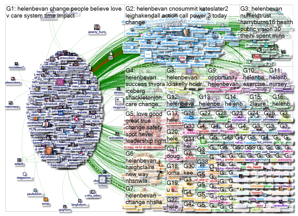
Source: https://nodexlgraphgallery.org/Pages/Graph.aspx?graphID=99578
It was clear that while Helen tweets about health and health services, few of her tweets mention words that are specific to either health or health services: topics such as leadership, innovation, kindness, organisations, teams and connections were more common. Unfortunately, these topics were so popular that global searches quickly reached the search limit for social network analysis (18,000 tweets), sometimes only extracting a few minutes of tweets. NodeXL will capture all tweets and retweets during the period of an extract, but clearly a very short extract might underestimate or miss the impact of a tweet. I therefore attempted to focus in on smaller geographies – for example a country or town – using the Twitter “geocode” command (focusing on a defined radius around geographical coordinates). I was still unable to find Helen’s tweets for popular topics. The case study on tracking a tweet on “innovation” provides more detail.
| Case study: attempting to study the relative reach of a tweet on “innovation” posted by Helen Bevan
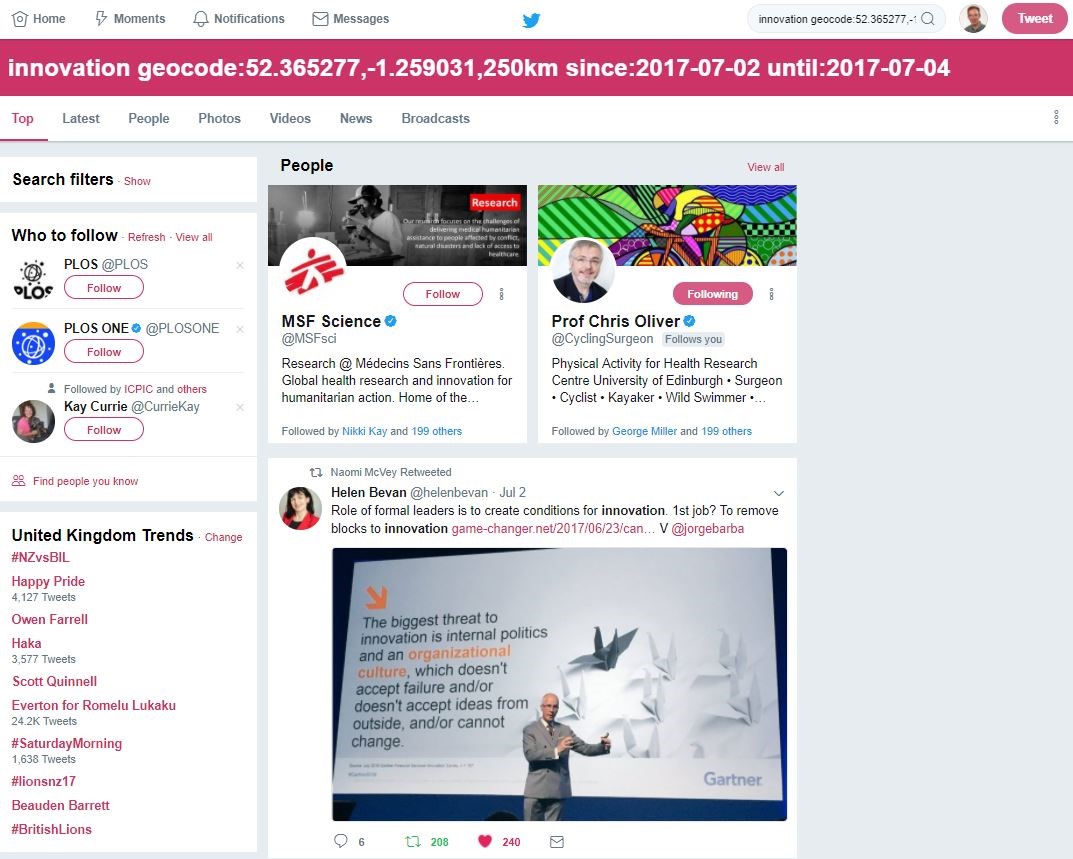
When I set out to quantify Helen’s reach on UK and global tweeting on a specific topic I started with “innovation”. Helen posted on innovation on 2 July 2017, late evening in UK, achieving over 200 retweets over a short period. I thought that this would be easy to find using social network analysis. The tweet was identified in Twitter searches for 3 July but curiously not for 2 July, presumably due to time zones: this is something to bear in mind if attempting to narrow a large search by time. The tweet turned up prominently in the “top tweets” list on Twitter (figure 2). The tweet also turned up on a NodeXL map of Helen’s username @helenbevan during the same period. Figure 2: Output from Twitter search for innovation, centred on Coventry, UK, with 250km radius
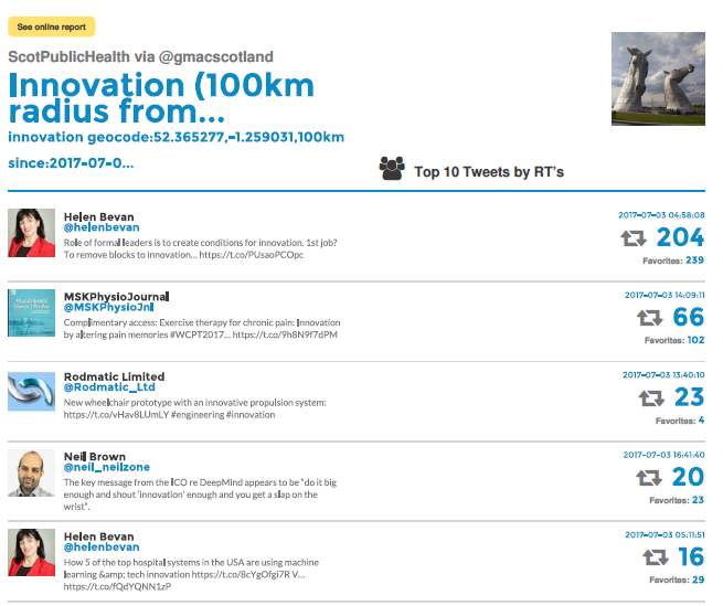
Source: screengrab for Twitter search, captured 8 July 2017 A search on the Followthehashtag site (for 3-4 July), with geocode for Coventry, identified Helen as top tweeter up to 140km (eg see this report to 100km). However, Helen’s tweets disappeared beyond that radius (eg see this report to 150km), even though Helen’s tweet had achieved a wider circulation than tweets remaining on the list. Figure 3: Search for “innovation”, focused on Coventry (100km radius)
Source: Output from Followthehashtag website The tweet was not picked up at all in NodeXL maps of “innovation”, repeated on multiple occasions, with or without geocode for the UK (eg 800km around the village of Haltwhistle, to capture the whole UK, or the city of Coventry where Helen is based – see examples from 2-3 July and 3-4 July)). I was failing to spot the “needle in the haystack” using NodeXL. This was frustrating because though other tools provide useful information, NodeXL will normally look beyond the basics to study interactions. It was worth persisting with the problem in an attempt to find a solution. |
I ran a series of further NodeXL searches on leadership, health and wellbeing, “social media impact”, kindness, empathy, burnout and other terms, looking for Helen’s handle and specific tweets. Again the extracts only included a short period of tweets (hours rather than days) for very popular terms, either at global, national or city level. Again Twitter searches and FollowtheHashtag reports repeatedly demonstrated that Helen’s tweets were among the biggest posts on the given topic (at UK level and sometimes globally).
Repeating the approach for other tweeters I was able to find their tweets in either global or geocode searches for even the largest topics, for example:
- “kidney disease”, looking for a tweet posted by a physician in Sydney, Australia using global and then geocode searches (Brendonln tweet 9 July identified in G4 in NodeXL search)
- “sleep tight” to see if I could find a tweet for footballer @IAmJermainDefoe’s tweet paying tribute to the late Bradley Lowery, a 6 year old football fan and adopted club mascot who died from complications of neuroblastoma (again this tweet was found amid a large volume of tweeting about the story, and more general tweeting nocturnal good wishes in this beautiful NodeXL map).
- ThomDavies’ “refugee health” tweet (G15 in uploaded NodeXL map)
- Brent Toderian tweet on infrastructure (see this NodeXL map.
I was also able to find Helen’s tweets in searches for topics with a lower volume of tweeting than “innovation” for example:
- “burnout” (a term used commonly during 2017 in relation to healthcare workers)
- “kindness” (global search (Figure 4a) but almost all the interactions drop out when repeating the search using geocode search focused on Coventry (Figure 4b))
- Appropriately a tweet on “social media impact” (figure 5) was also detectable (Helen was top influencer in G8 in NodeXL map)
| Figure 4a: Global search for “kindness”
Source: NodeXL |
Figure 4b: Search for “kindess” repeated using Coventry geocode
Source: NodeXL |


Figure 5: Tweet on social media impact
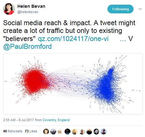
Source: Twitter
Testing a series of assumptions and altering conditions step by step I identified that there are quirks in the way that NodeXL works, that do not affect searches in the Twitter app/ website or on Followthehashtag. If a user has location turned on in both their profile and tweets then NodeXL will not pick up the tweet in a search that uses the geocode command. The NodeXL maps in figure 6 illustrate this for two users. To return to the cell culture analogy, including location in the tweet “killed” the NodeXL searches as effectively as infected albumin in the laboratory.
Figure 6: The impact of “location” (in tweet) in NodeXL searches
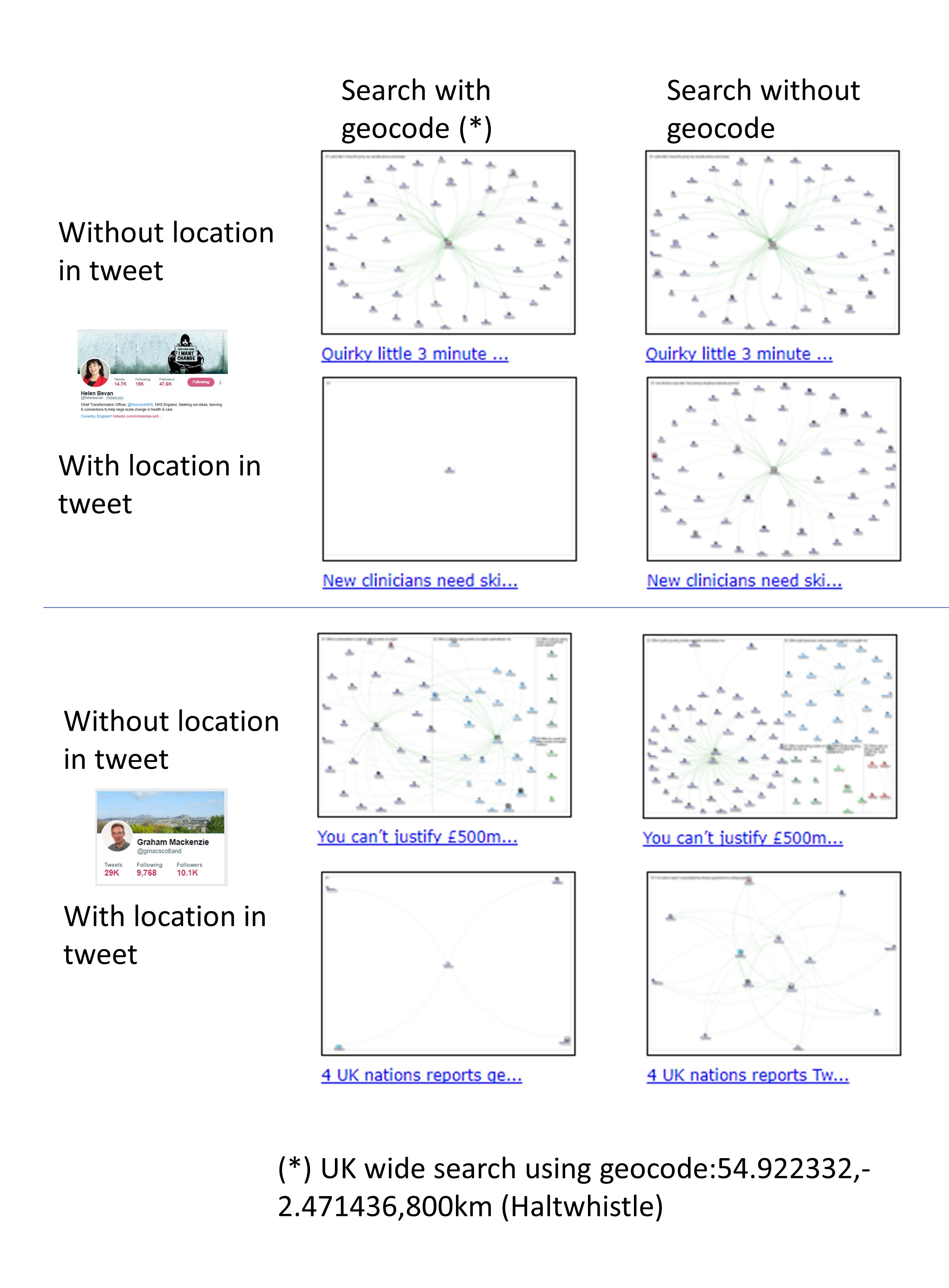
Sources: Helen Bevan’s tweets: “quirky little 3 minute film”; “new clinicians”; Graham Mackenzie’s tweets: “You can’t justify £500m”; “4 UK nations reports”
In summary, it was eventually possible to identify Helen’s tweets using NodeXL, but only when she turned off location in her tweets. This does not apply to Helen specifically – this is a quirk that mean that even the most prominent tweeters may be missed in very popular topics. For most topics however – for example a conference or a medium sized awareness campaign – social network analysis appears to capture a complete record of tweets.
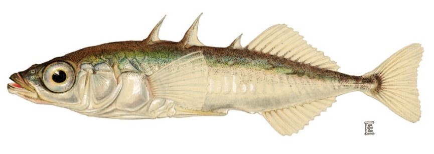
2) Filtering out the minnows and sticklebacks: The “needle in the haystack” example above applies to very specific circumstances. The next two examples – little fish, and big fish – apply to social network analysis more generally. The little fish – let’s classify them as innocuous minnows and the spikier sticklebacks – turn up prominently and sometimes repeatedly in social network analysis, but do not really have much influence.
NodeXL provides metrics that can potentially measure a tweeter’s influence. Figure 7 shows an example, listing “top influencers” (based on a measure of connectedness called “betweenness centrality”), for a search of the world’s top 5 medical journals.
Figure 7: “Top influencers” in NodeXL search of world’s top 5 medical journals, 1-8 July 2017
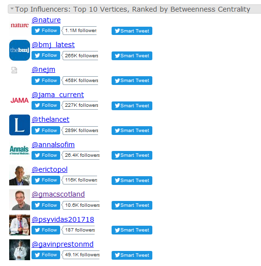
Source: NodeXL graph gallery.
There is no argument about the top of the table – the biggest medical journals are ordered in a way that broadly reflects the quality and popularity of their tweets and their number of followers. Further down the table prominent US physicians Eric Topol and Gavin Preston are unquestionably world class tweeters and their position reflects their status. I argue in the case study below, however, that my inclusion on the list is misleading: I am a “minnow” in the grand scheme of social media influence.
| Case study: A minnow characterised as a top influencer
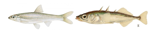
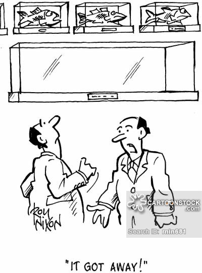
I posted tweets sharing NodeXL maps of the world’s top medical journals over the course of 2017. In the weeks after posting these tweets I featured prominently in the list of “influencers” on follow up NodeXL maps. There are two reasons, both artefactual – the first applied on each occasion, the second applied in one specific circumstance. Figure 8: Minnow
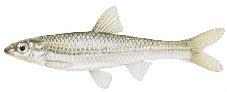
Source https://nature.mdc.mo.gov/discover-nature/field-guide/ozark-minnow First, the act of tweeting about the NodeXL maps the previous week, mentioning the different journals and other key influencers, increased my ranking by “betweenness centrality”, even without retweets, replies or other meaningful reciprocal engagements from the journals or other tweeters. This was an unintended consequence of my tweet. Despite a lack of engagement, the act of tweeting and mentioning these other accounts makes it look as if I am connected in social network analysis. It looks as if I am connecting distinct groups that do not normally tweet about each other. This phenomenon is one of the reasons why I have stopped tweeting about social network analysis, or at least hold off until after the conference or campaign that I am studying. Second, I posted a tweet on tobacco control, mentioning The Lancet (@thelancet), during the first week of July 2017. While this tweet received only a small number of retweets (n=4) and likes (n=6), a trail of replies mentioned my Twitter handle. These replies mentioned the journal and a number of vaping activists. This made me look further connected to a group individuals from a different “bubble” altogether, even though I did not reply to these tweets. These interactions were interesting in a way (they provide insight into other bubbles), but they cannot be considered as having an important impact on worldwide tweeting by or about the world’s top medical journals. Depending on which bubble you occupy you may consider that some of these individuals are minnows and others are the more dangerous looking sticklebacks. Figure 9: Stickleback
Source http://www2.dnr.cornell.edu/cek7/nyfish/Gasterosteidae/threespine_stickleback.html People tweeting on a topic, mentioning or being mentioned by a number of tweeters who are not usually connected, will have these apparent connections recorded in social network analysis, even when there is no meaningful relationship. These are small fish, regardless of the size of pond. There may be much more prominent influencers – for example authors of individual papers – who do not have reach beyond the individual journal. |
If we do not take account of the minnow/ stickleback effect we risk grouping minor players with the major influencers on a topic (eg if sharing a map with the listed influencers, or using NodeXL in an attempt to identify main tweeters at a conference or during a health awareness campaign). It is important to look beyond apparent influence to consider content of tweets and the reason for apparent connections.
To return to the cell culture analogy, we look down the microscope, record the conditions and results of the biochemical analysis, and check the plausibility of our findings, before we share the results. We should apply the same approach for social network analysis. We apply the same considerations to the rather bigger fish in the next section.
3) Working out the size of the pond for the big fish: In this section we look at the big tweeters – typically people with a large number of followers, but sometimes people who have captured the zeitgeist and have successful tweets despite a smaller number of followers. If NodeXL maps have the equivalent function to microscopy in cell culture, measures of connection (betweenness centrality – see above) and simpler measures including the number of tweets and number of followers are the equivalent of biochemical analysis. The number of tweets and followers can be used to estimate potential audience and reach, with caveats. All of these measures have their limitations or – to continue the fishy theme – slipperiness.
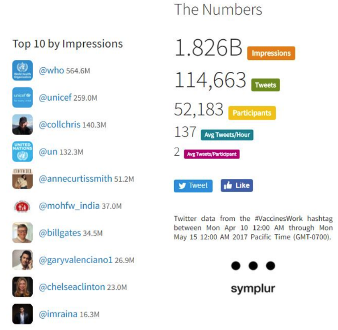
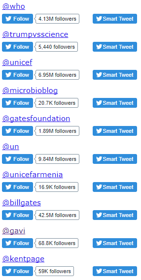
In my blog on the global Immunization Week (24-31 April 2017), I identified overwhelmingly positive tweeting about vaccination. Based on potential audience (measured by “impressions”) the big hitters were a mix of global organisations (WHO, Unicef, UN, Indian Ministry of Health & Family Welfare) and individuals with large numbers of followers (Figure 8).
| Impressions, as measured by Symplur healthcare hashtags = number of tweets posted by an account multiplied by number of followers of that account – a crude estimate of number of times that tweets by that account might have been seen. This risks over-estimation (many people will not have had their device switched on at the time of the tweet) and double counting (eg if people tweeting on a topic have the same followers).
Twitter analytics taps directly into Twitter’s own data, to give the actual number of times a tweet has been displayed. However, that information is only available to the user posting the tweet. |
Using information about content of tweets, potential audience and actual connections, we can try to understand the influence of these different individual tweeters. I extracted information about the top #VaccinesWork tweeters (based on impressions) in the weeks preceding the campaign, using the Symplur healthcare hashtags site. Based on tweet content, the purpose behind these individuals’ tweets varied: the actor, musician, philanthropists and cricketer were strongly pro-vaccination; one outlier was clearly anti-vaccine. It is potentially concerning, therefore, that the outlier had the third largest potential audience overall (figure 10).
| Figure 10: Number of impressions for #VaccinesWork prior to the campaign week (10 to 15 April 2017)
Source: Symplur healthcare hashtags (NB Symplur does not provide historical data beyond a few months) |
Figure 11: Connections around #VaccinesWork tweets, during the campaign week (27-30 April 2017)
Source: NodeXL sub-graphs |
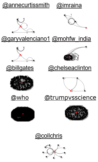
Looking at the patterns of connections during the campaign week for these “big fish” tweeters is instructive (figure 11, which maps a period of almost 3 days). Chelsea Clinton did not tweet during that three day period (27-30 April), which explains why there were only a small number of interactions mapped. Actor Anne Curtis Smith posted once. Bill Gates tweeted immediately before the study period (26 April). The Ministry of Health in India posted around 65 tweets. The anti-vaccination campaigner Chris Collins posted 11 tweets. Other individual tweeters from the list in figure 10 showed their support through retweets – for example a tweet by UNICEF Philippines.
The main point of interest here is the anti-vaccination campaigner Chris Collins. Despite a huge number of followers for an individual (784,744 followers at the time of the 2017 campaign), and a considerable volume of tweeting during this period (11 tweets, giving a hypothetical number of “impressions” as defined by Symplur of 8.6 million), the number of interactions around these tweets is small. Lack of interactions (replies, retweets, mentions) may not mean a lack of impact (there may be a subconscious effect of a steady flow of negative messages), but it is interesting nonetheless. It appears that this “big fish” is swimming in a small pond. The same can be said for some of the celebrity tweeting in support of vaccination.
Figure 12 shows the accounts with the most apparent influence during 2017 #VaccinesWork campaign, measured by “betweenness centrality”. All of these accounts posted or retweeted pro-vaccination messages. Global organisations such as WHO, UNICEF and UN, and prominent figures such as Bill Gates had tweets with huge numbers of interactions, largely supportive. These are big fish in a big pond. Trumpvsscience is a Twitter bot which retweets messages on a series of topics including #VaccinesWork. Despite the large number of apparent connections that this retweeting generates (see figure 11) trumpvscience is more “minnow” than “big fish”. Indeed, there are some inadvertent “stickleback” characteristics because of indiscriminate retweeting, some of which gives anti-vaccination activity a wider audience.
Figure 12: Top influencers on NodeXL map of #VaccinesWork (27-30 April), by betweenness centrality
Source: NodeXL
We need to consider both the simple metrics (eg number of followers) and connections (NodeXL maps). Big tweeters posting anti-public-health messages could potentially do a lot of harm if their inaccurate messaging started to influence their large number of followers. However it would seem likely that such influence would be marked by a trail of likes and retweets, both of which can be recorded through social network analysis tools. Most of the posts by anti-vaccination campaigners are myth based, using a relatively limited number of bogus arguments. Some people may be tempted to wade in to post counter arguments that support vaccination, but that approach is likely to be full of risks. Social media analysis provides insight into the peculiar and dangerous world of the anti-vaccination movement, helps to identify influencers with potentially wide reach, but crucially also allows us to quantify the size of their pond (or bubble).

4) Slicing out the spam: Spam is a nuisance that can affect any type of internet activity. In contrast to the minnows, sticklebacks and big fish identified earlier, which represent different voices and opinions and therefore a window into different bubbles, spam has no redeeming features. It is nuisance content, for commercial or other nefarious/ criminal purposes. In cell culture the equivalent would be the infected albumin.
Checking top influencers in outputs from any of the analytical tools will help identify minnows and sticklebacks, but also spammers. Case study 3 shows how we can slice out the spam in social media analysis.
| Case study: Slicing out the spam
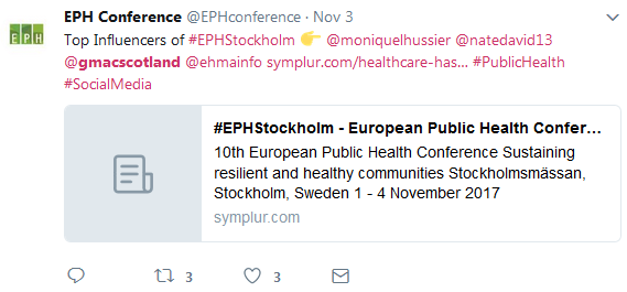
At the European Public Health conference in early November 2017, one individual appeared prominently, posting offensive material. This tweeter adopted various guises (David Nate or Nate David) and posted repeatedly. Presumably the spammers bought followers because despite the distinctly unpleasant content they had a large following. By simple measures – number of tweets and number of impressions, the spammers were “influencers”. Indeed, they turned up in a tweet posted by the conference organisers as a “top influencer” (Figure 13). Figure 13: Tweet by conference organisers, mentioning spam account
Source: Twitter Reporting the spammer meant that the account was deactivated after a day or two. However, during the conference the account still turned up on the NodeXL maps. Fortunately Twitter has a feature that allows us to exclude terms from a search, using the “-” symbol. This is equivalent to “NOT” in a Boolean search. This function is also available in NodeXL, allowing us to map the conference hashtag without the offending account. We had sliced out the spam. This approach can also be used in Followthehashtag reports, but not Symplur reports. |
5) The “ones that got away” – and how to include them in the final analysis
The starting point of any research project is a literature review. Whether systematic or less structured it is important to look beyond the obvious papers to include papers that used different key words, or papers that took a more left field approach. This will require different approaches:
- extended search terms initially
- internet trawls that will complement searches of academic databases
- reading reports published in other ways including blogs, articles in the general media and material published by individuals and organisations interested in the topic (grey literature)
- asking colleagues interested in the topic.
Analysis of social media activity involves similar approaches. It is not enough to simply rely on the official hashtag, or even any hashtag at all. Sometimes people will tweet without using the campaign hashtag. This activity might be picked up by including a plain language version of the hashtag (eg “World AIDS Day” as well as #WorldAIDSDay). See my blog on evaluating world antibiotic awareness week for a fuller exploration. However, there may be lots of potential permutations, terms may not be specific enough to filter down to tweets of interest, and sometimes the key message is included in an expected turn of phrase or even an image. Sometimes others will flag up these tweets to the wider community by “quoting” them and adding the hashtag, so that others interested in the campaign spot them. The quoted tweet may not be as popular as the original tweet, and it can be time consuming to sift through these posts. Asking others interested in a topic may help identify these elusive tweets.
One example is provided by the #futurenursing and #futuremidwifery campaign, January 2018. In the first few days of the campaign Helen Bevan posted a tweet that summarised and promoted the campaign, used an effective image, asked for supporters to retweet the message, and tagged some of the key influencers in the campaign. The post did not include the hashtags, but that did not necessarily matter in terms of spreading the message: by 19 January there had been 314 retweets and 295 likes. The post promoted a crowdsourcing site that is gathering information about the campaign. Analytics from that site will reveal which internet domains have encouraged people to visit and contribute.
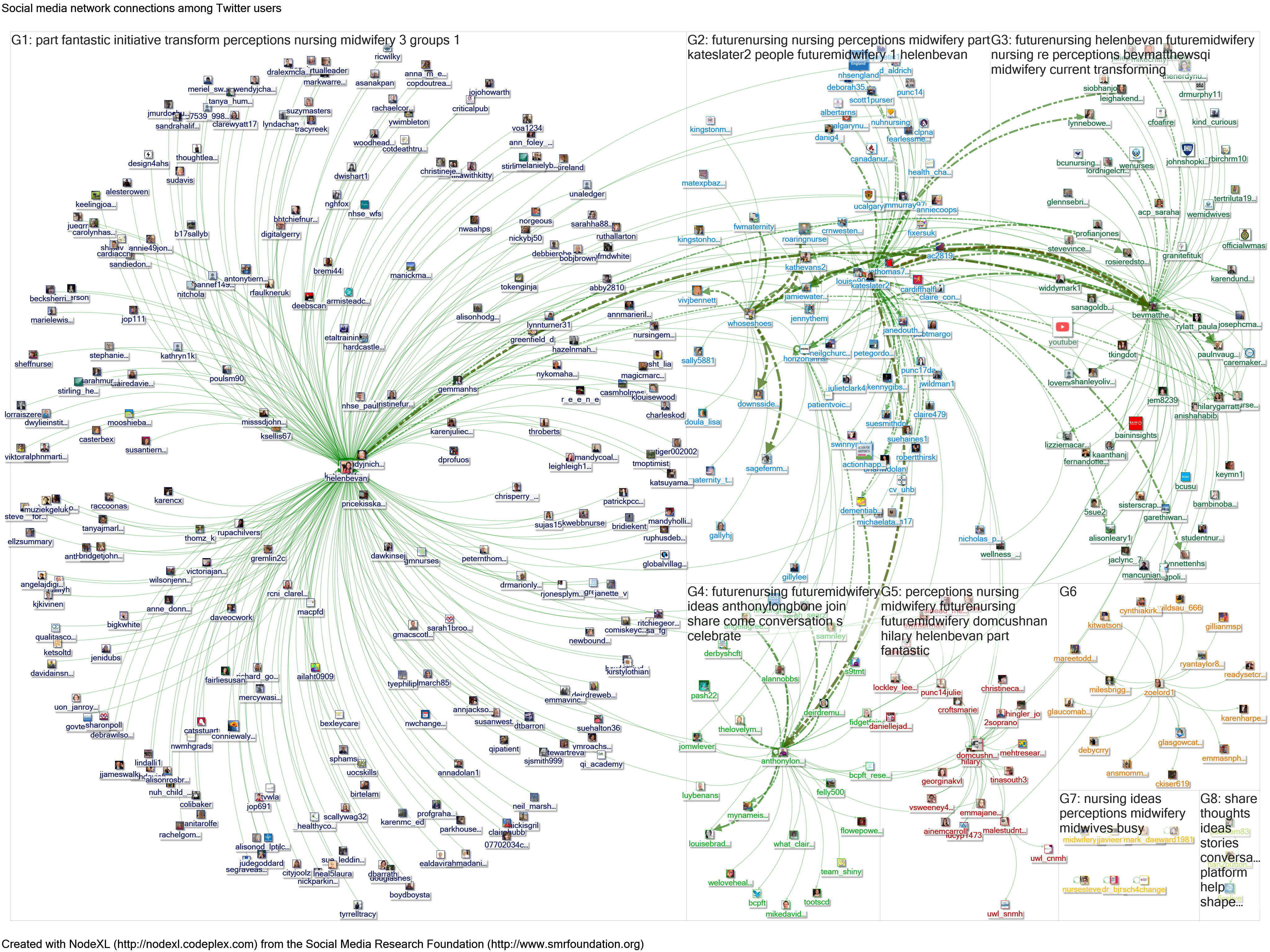
Figure 15 shows four different ways of mapping the tweets around the campaign using NodeXL. Adding in Helen Bevan’s tweet shows a much wider reach of the campaign. Clicking into the NodeXL reports for the different searches shows the different search terms required for this extended analysis. Using the URL for Helen Bevan’s tweet (search b) only finds those tweets that “quote” that tweet. Using wording from Helen’s tweet (search c) shows the extent of the retweets. Use Twitter advance search to find ways to make the search as specific as possible (including Twitter search terms such as “from:” will be useful). Using these combined approaches it is possible to include those missing tweets in a NodeXL map, adding valuable information regardless of the size of the campaign. It is also possible to combine searches over time (eg to look at a full month rather than the usual limit of 9-10 days for a NodeXL search).
Figure 14: Helen Bevan’s tweet about the future nursing, future midwifery campaign
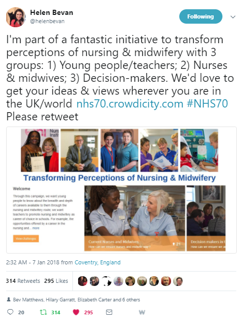
Source: Twitter
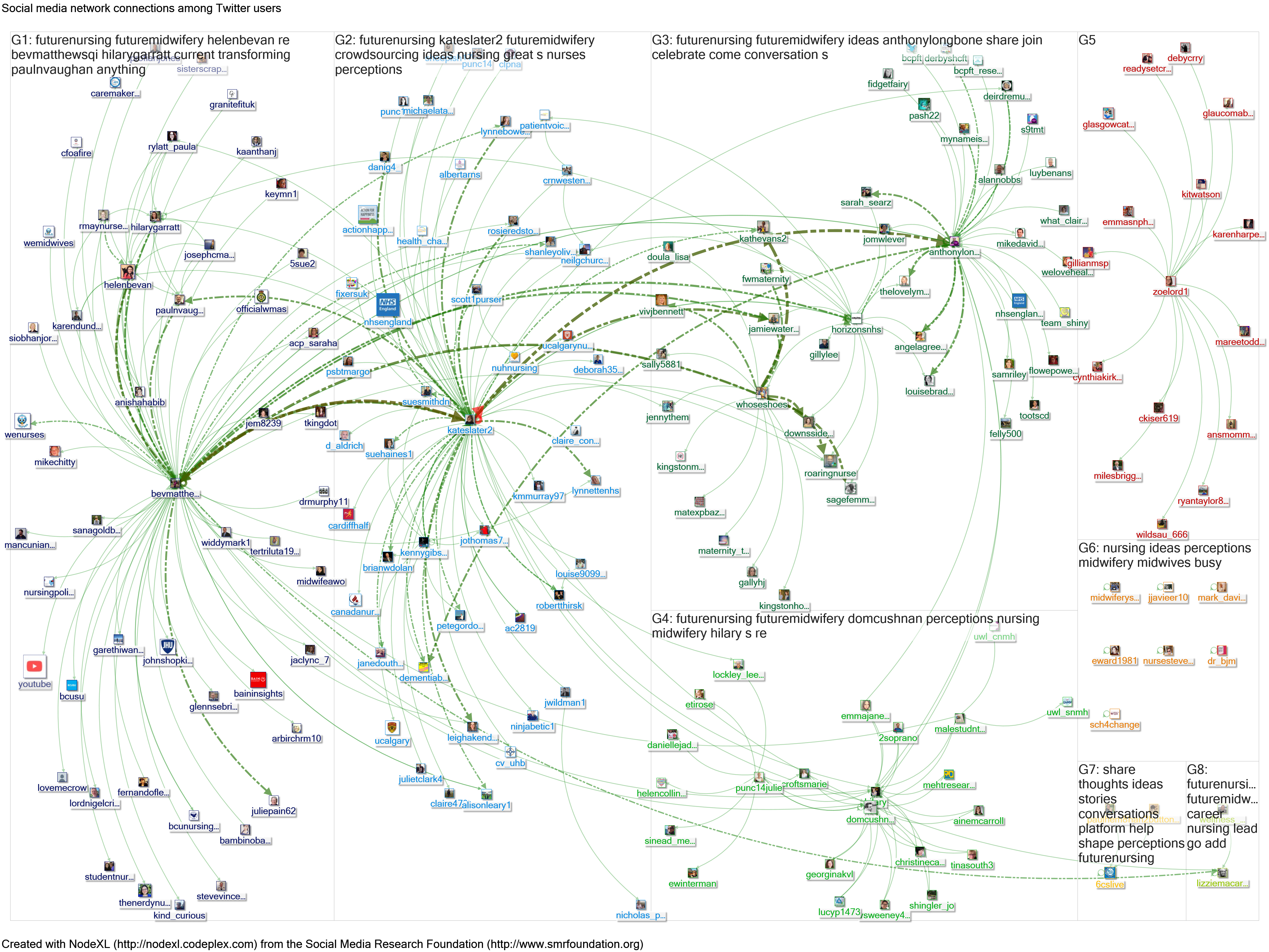
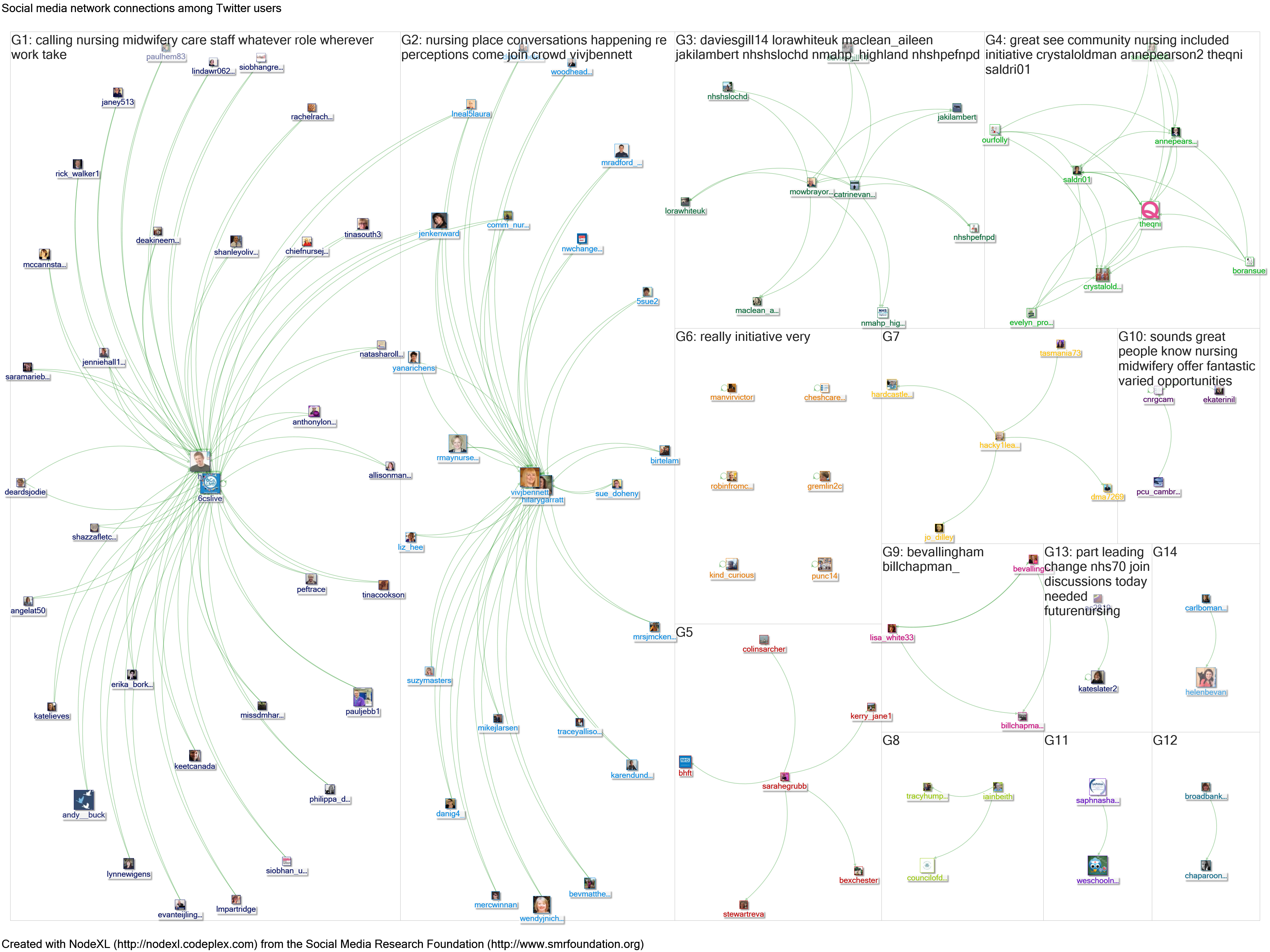
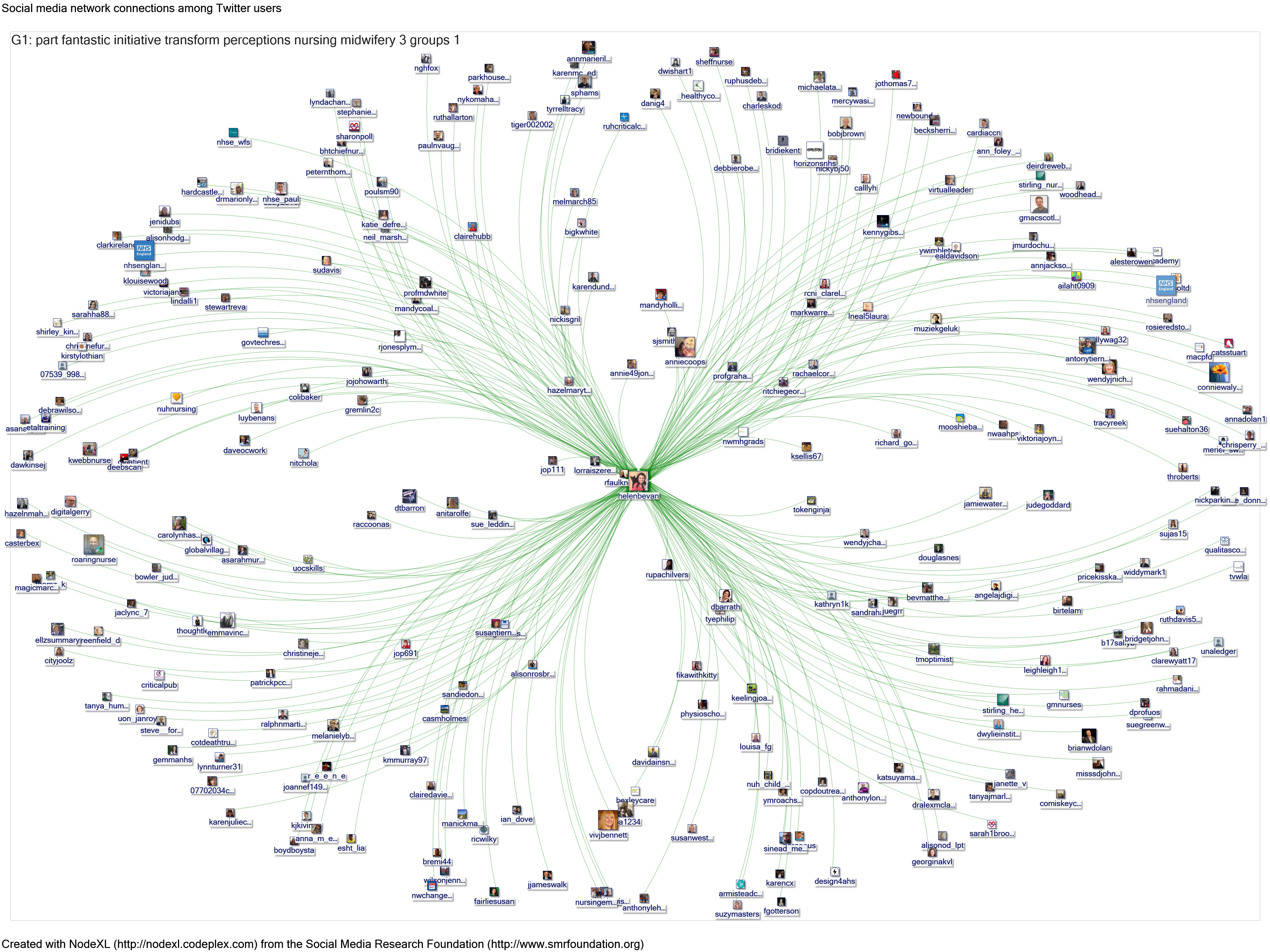
Figure 15: NodeXL maps of searches about the “future nursing/ future midwifery” campaign, 1-10 January 2018. Search a looks at tweets using the hashtags. Searches b and c look at a tweet that did not use the hashtags. Search d combines these searches. Click image to see high resolution map. Click link below map to see full report.
| a) Basic search of #futurenursing OR #futuremidwifery
|
b) Map of tweets mentioning Helen Bevan’s tweet
|
| c) Map of retweets of Helen Bevan’s tweet
|
d) Map of all three searches
|
Conclusions:
It is important to check any output from social media analysis, whether simple counts of tweets/ followers, or more complex social network analysis. Looking at all the information together helps to assess reach and influence. The 5 “problems” with social media analysis identified here, and approaches to minimise their impact, are summarised below. Have a go at analysing your own campaigns and post your own challenges below.
Dr Graham Mackenzie, Consultant in Public Health, 19 January 2018


Pingback: How to run social media for a health conference: planning, tweeting and summarising – #ScotPublicHealth
Pingback: Handing over the reins: crowdsourcing Twitter data on health campaigns – #ScotPublicHealth
Pingback: Julio Mayol » Twitter and T84 cells