It is almost 50 years ago since “Our World”, the first live international satellite TV broadcast, most famous for the first performance of The Beatles’ “All You Need Is Love” (25 June 1967). The show reached an audience of 400-700 million. The most famous band on earth beamed out to living rooms across the world. This was an impressive achievement, but the information flowed just one way. The digital revolution was yet to happen.
Between 24 and 30 April this year Immunization Week tweets using the #VaccinesWork hashtag passed across devices almost 1.5 billion times(1). Information flowed in both directions – international and national health organisations promoting vaccination, and individuals responding and sharing information of their own. The overall impression of Immunization Week is an extremely well planned and organised multi-agency international campaign, with plenty of evidence-based tweets using images and links to informative webpages. There were tweets by national organisations that provided country specific information. There was also a considerable amount of high quality and informative tweeting at individual level, by clinicians, parents and many others, though these posts risked being overwhelmed by tweets from international organisations in the “big data” analysis. While there was some negative tweeting by anti-vaccination campaigners, some of them with considerable reach on social media, the balance overall was firmly in favour of vaccination.
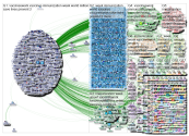
This blog summarises the main findings of the big data analysis, pulls out some detail (eg top tweets and resources, the type of influence exerted by top tweeters), and describes the methodology (basic and advanced) so that others can repeat this type of analysis on other global health campaigns. The big data techniques include NodeXL maps, similar in appearance to the spread of communicable diseases (figure 1), except in social media analysis spread is usually seen as a positive. I have used two Public Health evaluation frameworks to summarise main findings (Donabedian’s Structure, Process and Outcome; and RE-AIM).

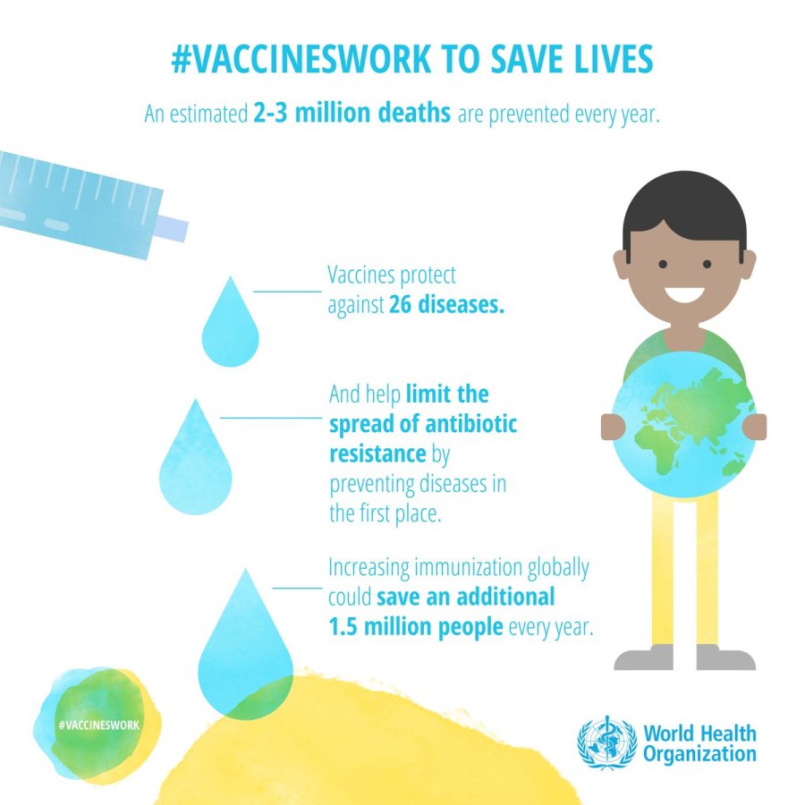
If you are looking for a simple summary of the benefits of vaccination – reduced morbidity, reduced mortality, economic benefits – there are plenty of resources from international and national organisations (eg from WHO Europe, NHS Inform and the Gavi vaccine alliance). Despite all its obvious benefits, vaccination has been the target of negative campaigning and, along with climate change, provides a case study of how “alternative facts” are used to undermine scientific understanding and progress. An article in the Science journal (identified in the course of studying #VaccinesWork tweets) provides an excellent summary dispelling the four most dominant myths. A recent blog post by SkepticalRaptor has looked at links across a wider anti-science movement. As a Public Health doctor I am interested in promoting vaccination, and understanding the impact of negative views.
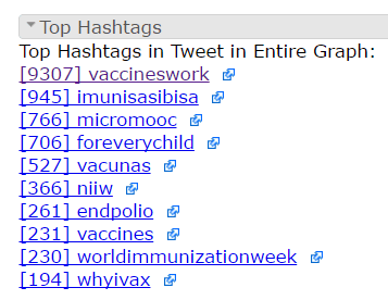
Social media provides previously unimaginable opportunities for information sharing across the world, by both organisations and individuals. With 80k tweets and retweets using the #VaccinesWork hashtag during Immunization Week, the volume of information shared is potentially overwhelming. However, as described previously on ScotPublicHealth.com there are powerful tools (eg NodeXL) that allow us to identify the biggest influencers, weblinks (URLs), words, word pairs and other hashtags in tweets using that hashtag. Looking beyond the official hashtag (#VaccinesWork) we can also look at other campaigns that ran during the same week including national infant immunization week (#NIIW, where “national” mainly meant USA), #whyivax and #ivaxtoprotect. For interest I have looked at tweets that used the terms “immunization week” or “immunisation week”, with or without the official hashtag. Looking at all the search terms together, however, #VaccinesWork was by far the most used term. The analysis presented below is not exhaustive – there was also an African campaign #AVW17, but I spotted that too late for this blog because of the time limits of social media analysis.

My previous ScotPublicHealth blogs using Twitter “big data” have focused on large international conferences – a European Public Health conference in November 2016, and the international quality improvement forum in April 2017. Looking beyond simple measures of number of tweets, impressions(1) and tweeters, it is possible to look at estimate of audience(2), and the interactions around the tweets and tweeters(3). The tweets from the two conferences that I have written about previously followed the natural course of any large international conference – a few thousand tweets that document the buzz prior to the event, plenary sessions, breakouts, general conversation, tying up and departure.
The mass of tweets from international campaigns presents an altogether different challenge. I have run extracts of tweets from such activities looking at Earth Day, March for Science, NHS March and other large global movements with huge volumes of tweets over a short period. With existing limits to the scale of analysis using Twitter data (max 18,000 tweets per NodeXL extract) it is sometimes only possible to look at a few minutes of tweets (eg for the Earth Day analysis). That limits the study of interactions around the tweets using NodeXL. A quite different picture emerges as you look beyond minutes and hours to view interactions over days (up to 9 day maximum): a popular tweet may connect with thousands of other Twitter users over time, with a web of connections on the NodeXL map; a popular website (eg video, article or infographic) may be tweeted about by lots of different people as a campaign unfolds and information is shared within networks, and NodeXL quantifies that level of interest. Insights from such analysis go well beyond the understanding possible by simply reading Twitter feeds. Nonetheless, it can be instructive to look at a top 10 tweets (ranked by number of retweets), and I have attempted this type of extract for the first time in this analysis(4).
For the #VaccinesWork analysis it was feasible to study tweets on a day by day basis (<18,000/day), though full extracts were not possible on Tuesday 25 April or Wednesday 26 April, despite multiple attempts (release of tweets by Twitter is sometimes a limiting factor). A longer extract was available later in the week (27-30 April), and this forms the main focus of this blog, because that longer period allows us to study interactions in a bit more detail as described above. The following week (1-7 May) a complete extract was possible, and I have used this and subsequent weeks to look at some of the top influencers in more detail beyond the campaign period.
In Public Health work an evaluation involves identifying an intervention (here this would be Immunization Week itself), and studying structure, process and outcome. This framework was published by Avedis Donabedian in 1966 and has stood the test of time. A further analytical structure is provided by RE-AIM, which looks at reach, effectiveness, adoption, implementation and maintenance in the planning and evaluation of an intervention. The following section explores Immunization Week (24-30 April) using these headings (slightly rejigged for the specific context), informed by the data available through different social media tools.
Reach and maintenance: The Symplur health hashtags website provides data on number of tweets(5), tweeters(6) and impressions(1), and allows us to look at a period of up to 120 days or 150,000 tweets, with data stored for up to a year.

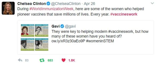
WHO, UNICEF and UN achieved huge numbers of impressions by posting a series of attractive and informative tweets over the course of Immunization Week. Ministry of Health & Family Welfare, Government of India promoted vaccination during the week and beyond. Three celebrities (Filipino/ Australian model and UNICEF Celebrity Advocate for Children Anne Curtis Smith, Filipino musician Gary Valenciano and Indian sportsman Suresh Raina) were among the top influencers, largely through retweets. Philanthropists and advocates Bill Gates and Chelsea Clinton had impressive reach from well-chosen tweets and retweets. There was one anti-vaccine activist on the list (Chris Collins), who kept churning out negative messages to his large number of followers; in terms of “impressions” these tweets have as much “reach” as the larger international organisations some weeks. During Immunization Week itself however the pro-vaccination tweeters dominated with the anti-vaccine campaigner demoted to number 7, albeit with a considerable number of impressions for that period (18.8 million).
The number of tweets using the #VaccinesWork hashtag peaked early during Immunization Week (24 April). Though activity during the week was very substantially higher than preceding weeks (figure 3), it fell away to baseline activity quickly after the week ended (average of 478 tweets per hour during Immunization Week compared with 32 tweets per hour during the first two months of 2017 and 44 tweets per hour between 8 May and 21 May 2017). This is a very typical pattern for a social media awareness week. Impact on real world behaviours is, of course, beyond the scope of such an analysis. In terms of maintaining impact, large international organisations could schedule tweets with some of the materials developed for Immunization Week throughout the rest of the year without incurring additional costs, and without negative impact on their social media presence.

Number of impressions(1) does not equate to audience (number of people potentially seeing the tweets). A web-based tool called “Follow The Hashtag” allows us to look at both impressions and audience. There is a limit of 1,500 tweets using this tool (requires small payment) and there is a limited window of opportunity to refine searches by specific time period. A search between 20 and 21 April 2017 identified 1,483 tweets with 8.1m impressions and 6.1m audience, giving an estimate of 1.33 impressions/ audience. Clearly these figures do not translate for Immunization Week – 1,469 million impressions from 80,265 tweets and 39,663 participants – as estimates of number of monthly active Twitter users were put at only 328 million for the first quarter of 2017. Nonetheless, the reach of Immunization Week tweets during 2017 was impressive. See footnote 7 to place these figures in historical context.
Effectiveness and implementation: There are a number of ingredients to an effective tweet – an image or video, a weblink (URL) to find out further information, a hashtag, “mention” of another user (eg @WHO). The interactions around a tweet – another potential measure of effectiveness – can be measured by tools such as NodeXL (though see some caveats in note 3). Using NodeXL to extract tweets using #VaccinesWork and other search terms we can look at interactions overall, and top 10 tweets.
Including the #VaccinesWork hashtag in a tweet has a clear impact on the likelihood that a tweet will be seen, retweeted and/or receive replies from other users. Figure 4a shows tweets mentioning “Immunization Week” or “Immunisation Week” between 24 and 30 April inclusive. Figure 4b shows the same search, but excluding tweets using the #VaccinesWork hashtag, showing a much more fragmented picture. Figure 4c shows a map for #VaccinesWork for the longest possible period during the vaccination week (27-30 April); while there is still some isolated tweeting in this final map (people who have tweeted without mentioning other users and who have not been retweeted or replied to) the overall impression from this map is of extensive interaction within and between groups. Click the maps to see the full reports.
|
|
|


The top 10 tweets for this period and beyond are collated in a Storify summary, allowing us to view the tweets and number of retweets/ likes very quickly (see note 4 for method; the results are more accurate and complete than Twitter’s own “top” tweet feature for the equivalent time period). Using outputs from my analysis, the top tweets for Immunization Week itself are split into two separate analyses for Monday 24 April and Thursday – Sunday of that week (ie 20 tweets). The top tweets are from international organisations and global figures. There is not a single negative message within these tweets. There are some repeated tweets and some sharing of messages between international organisations. The tweets mainly follow the ingredients for a successful tweet (image or video in all but one, link to webpage or video in 15/20 tweets, plus clearly worded messages). There is little use of “mentions” in these tweets, but name dropping is not really necessary when you have millions of followers (3.6m, 6.1m and 8.9m for WHO, UNICEF and UN respectively)! The number of retweets is impressive, even for repeated messages. Animations and static images were both popular, and there appears to have been considerable sharing of messages beyond the period studied. The first tweet quoted in the Storify summary (WHO tweet on 2m deaths prevented per year though vaccination) was retweeted 1,625 times during 24 April but has now been retweeted 6,100 times. There appears to have been a clear plan by the big international organisations (WHO, UNICEF, UN and their regional entities), which has been implemented effectively.

Looking at interactions (mentions, replies, retweets) for 27-30 April using NodeXL (longest period possible during Immunization Week with limit of 18,000 tweets) we can begin to understand impact of tweeters beyond the individual tweets and simple counts of retweets (full NodeXL report here). The big names (main maps in figure 5) are organisations and individuals who have been retweeted and mentioned a lot. I have also pulled out the other interactions as NodeXL “subgraphs”, to see the overall patterns more clearly, showing the equivalent subgraph for WHO for comparison.
Trumpvsscience is a campaigning entity that retweets information about climate change and, in this context, vaccination; it features as a top influencer in the NodeXL analysis (number two behind WHO). Rather than an opinion former like WHO (which generates and tweets its own content) Trumpvsscience is an information disseminator. Trumpvsscience has “interactions” across the NodeXL map, but with 3,835 followers its impact will be less than WHO and the other big international organisations. Indeed, in (automatically?) retweeting messages using #VaccinesWork hashtag it will from time to time retweet anti-vaccination messages.
The most striking point from figure 5, however, is the limited interactions around anti-vaccine campaigner Chris Collins’ tweets. As noted in the “reach” section above he has a huge number of “impressions”, and therefore a considerable audience, but this NodeXL analysis demonstrates that he has very few interactions from other Twitter users around his #VaccinesWork tweets. Reach does not equate to effectiveness.

NodeXL also provides word sentiment analysis in its reports. For the period mapped in figure 5 there were 13,989 tweets from 11,643 tweeters. The balance of “positive” to “negative” words was 7,107 to 4,472. This is a very favourable ratio, particularly as many medical words, including communicable disease and treatments, are classified automatically as have a “negative” sentiment (we don’t want to be ill after all). There were 158 “angry/ violent” words, representing a small proportion of this huge body of tweets.
NodeXL also provides an extract of top links included in tweets, taking that information from all the tweets using the selected hashtag. The main links for the search shown in figure 5 are to official campaign pages and materials (number in square brackets = number of tweets/ retweets that included the individual weblinks).
[1174] http://www.who.int/mediacentre/commentaries/2017/embrace-facts-vaccines/en/
[546] https://www.unicef.org/immunization/immunizationweek?utm_source=twitter&utm_medium=social&utm_campaign=WIW2017
[543] http://who.int/campaigns/immunization-week/2017/en/
[272] https://twitter.com/WHO/status/857974937637847041
[238] http://www.who.int/features/qa/vaccination-antibiotic-resistance/en/
[184] http://www.who.int/campaigns/immunization-week/2017/es/
[153] http://www.who.int/mediacentre/factsheets/fs367/en/
[143] http://www.who.int/mediacentre/factsheets/fs286/en/
[106] http://www.who.int/immunization/newsroom/press/global_immunization_impact_constrained/en/
[106] http://www.african-vaccination-week.afro.who.int/en/
The main campaign sites also feature prominently in the following list from the search shown in figure 4b (immunization week tweets excluding #VaccinesWork hashtag). The top article (from Independent website) covers the harms caused by the anti-vaccination movement, but you have to read right through to the end of the article to reach the positives of vaccination, which makes this a curious. Other newspapers and websites, the American Public Health agency CDC and vaccine developer MSD also feature in this list. Of the 3,288 tweets and 3,057 tweeters in this map there were 1,201 positive words, 325 negative words and 3 angry/ violent words. The balance, even away from the official tweeting for Immunization Week, was therefore largely positive.
[105] http://www.independent.co.uk/life-style/health-and-families/world-immunisation-week-anti-vaccine-movement-rise-vaxxers-mmr-autism-scare-big-pharma-government-a7705806.html
[73] http://www.who.int/campaigns/immunization-week/2017/es/
[65] http://www.wikidoc.org/index.php/Main_Page
[56] http://www.who.int/campaigns/immunization-week/2017/en/
[42] http://www.who.int/campaigns/immunization-week/2017/event/es/
[41] https://www.cdc.gov/vaccines/events/niiw/overview.html
[26] http://www.msd.com/about/featured-stories/world-immunization-week.html?utm_source=twitter&utm_campaign=msd_worldimmunizationweek_4.24.17
[25] http://who.int/campaigns/immunization-week/2017/en/
[23] http://www.hindustantimes.com/health/world-immunisation-week-rumours-becoming-the-biggest-hurdles-to-immunisation-in-india/story-RP0sIqBPeU9gPIdtWaFlLO.html
[21] http://www.hindustantimes.com/health/world-immunisation-week-gujarat-holds-india-s-worst-record-for-number-of-vaccinated-children/story-RHyJe8ULY2ysGT2jGbnc8H.html
Adoption: The official hashtag for Immunization Week was #VaccinesWork. There were, however, other vaccine related campaigns during this week, and I wondered if other user generated hashtags (eg #WIW, #WorldImmunizationWeek, #EuropeanImmunizationWeek) might have diluted messages. The proliferation of hashtags in such campaigns can be confusing. I had a look at other hashtags during the early part of the week, running a combined NodeXL analysis with a selection of these hashtags. #VaccinesWork was so dominant in that search, and in the searches summarised in figures 4a and 4b that I felt able to focus on this hashtag specifically for the rest of the week. The clear purpose of the campaign was reflected in this hashtag, was well known by many Twitter users already, and was adopted readily by many tweeters. This helped bring the campaign together, but the large international organisations dominating the tweets risks reducing the variety of materials shared in such campaigns. I have provided links to NodeXL searches using these additional hashtags at the end of this blog. Full extracts are available and can be analysed using the methods described in this blog.
Based on this analysis it is possible to complete Donabedian’s three components to an evaluation.
Structure: Immunization Week was a coordinated campaign with synchronised materials (websites, images, films), and accompanying “Vaccine Wars” articles in Science journal. I am not sure whether other activities eg national Infant Immunization Week (NIIW) were formally affiliated with the larger global campaign. Networks and individuals tweeted and retweeted their own materials, but the official campaign materials dominated. The fact that Immunization Week happens on exactly the same dates every year (24-30 April) and uses the same hashtag each year (#VaccinesWork) is an advantage, and makes communicating messages simple and easy. The existing activity around the hashtag year-round does not appear to complicate the messages and analysis of Immunization Week itself. Symplur and NodeXL analysis can be used as described here to monitor the activity of anti-vaccination campaigners as described here.
WHO, UNICEF, UN and others presumably had a planning committee and editorial team to decide on messages, produce web content (text, images, videos and animations), and schedule tweets. With an established week (always 24-30 April) other contributors (eg Bill Gates, Gates Foundation, Chelsea Clinton) would have had prior notice to produce and post material.
[Continues below]

Process: Information was posted by the international organisations in a way that made a whole stream of tweets available on all aspects of vaccination including: the diseases protected against; adverse outcomes of these diseases; different vaccines by age group; uptake of vaccines; safety; new developments etc (eg see WHO tweets).
Information was posted at different times, by region, and in various languages.
The campaign hashtag was included on materials and websites. Other organisations, networks and individuals were encouraged to share these and their own materials promoting vaccination.
It appears from the analysis here that the materials shared by the large international organisations were not adapted very much, if at all, over the course of the week. It would have been good to have seen some of the best materials from other sources retweeted by WHO, UNICEF, UN et al. Going back to the Beatles broadcast of 1967, the opportunities of the digital revolution are two way. Big data techniques can help us look beyond the main campaign materials to explore other information (eg analysis around figure 4b). Exploring the data using NodeXL and Twitter itself identified a rich seam of material beyond the official campaign, including the Science journal infographic above and Roald Dahl’s open letter below.

Outcome: The Immunization Week campaign undoubtedly had huge reach, and an impressive though unmeasured audience. Top interactors, links and other materials shared, and the word sentiment analysis, point towards a largely positive outcome of the campaign. Tweeters viewed and shared information about all aspects of vaccination. Negative messages promoted by anti-vaccination campaigners had little traction, and appear to have been widely ignored. This analysis focused specifically on Twitter. Reception and outcomes may have been different on other social media and in the real world.
Conclusions: Twitter big data provides an opportunity to extract and study huge volumes of tweeting. The Immunization Week campaign using the #VaccinesWork hashtag was impressive in planning and scale, including official materials produced by international organisations, and a more diverse range of materials produced by individuals and national organisations.
The Public Health frameworks presented here (Donabedian’s SPO and RE-AIM) provide a clear structure for reporting these complex data.
NodeXL, Symplur and FollowTheHashtag provide different metrics around a hashtag, with NodeXL providing opportunities to look further (user name, words and phrases, hashtags). In this blog I have used NodeXL to produce top 10 lists of tweets for the first time. This is useful additional information, and will become a feature of future analysis.
Dr Graham Mackenzie
Consultant in Public Health
21 May 2017

Notes (further data provided below)
- In Twitter parlance a tweet passing across a device = an “impression”. Of course that doesn’t mean that that tweet was actually seen – perhaps that device’s owner was away making a cup of coffee.
- FollowTheHashtag provides an estimate of audience – the number of people with a Twitter account who have had the Twitter displayed on their device. As users may be served multiple tweets “audience” will be a smaller figure than “impressions”.
- NodeXL looks at interactions between tweeters, and allows searches around words, hashtags, Twitter usernames (“handles” eg @WHO for World Health Organisation) and weblinks (URLs). These interactions are shown as lines on a NodeXL map. Pew Research has studied social media analysis with NodeXL developers Social Media Research Foundation and explains as follows: “Each line represents a link between two Twitter users who follow, reply to, or mention one another. Inside a group the lines make a dense mass. Between groups, fewer people follow one another”. The biggest influencers are identified as those with highest “betweenness centrality”, which Pew Research explains is an attempt to “identify key people in influential locations in the discussion network, highlighting the people leading the conversation”. The algorithm used does indeed pick up the main influencers (eg WHO, UNICEF, UN for #VaccinesWork), but it can also pick up Twitter accounts that have simply tweeted a lot using the hashtag in question, or that have retweeted a lot of tweets using that hashtag (eg an enthusiast in the topic, or a Twitter bot programmed to retweet all posts using that hashtag). Tweeters who name drop a lot (“mentions” in Twitter terminology) can also turn up in the top influencers, despite the minimal impact of these tweets in terms of impressions, audience or retweets. Tweeting or retweeting a lot, perhaps to a relatively small number of followers, does not equate to actual influence, so it is important to interpret findings with caution, and ideally using information from a range of different sources.
- NodeXL does not give a list of the top 10 tweets, but that information can be derived from the information in the full Excel spreadsheet used in the analysis. The Excel spreadsheets for all my analyses are included on the NodeXL Graph Gallery website (search for ScotPublicHealth; look at third link from bottom of each report “Download the Graph Data as a NodeXL Workbook”). In worksheet “Edges”, take the whole of column Q (“Tweet”, which contains full text of each individual tweet) and paste into another worksheet. Run a pivot table for “Tweet”, selecting this variable for both rows and values in the pivot table (set as “Count of Tweet”). Cut and paste the output of the pivot table (“paste values”) into another part of the worksheet and use Data/Sort to sort from largest to smallest value. The value of “count of tweet” takes a bit of interpretation – it includes both the number of retweets and the number of times other Twitter users are mentioned. A tweet with a modest number of retweets that mentions several other people will therefore appear more times than expected. I have used two methods to work out the number of times a tweet has been retweeted:
- EITHER Take the top 20-30 tweets by the “count of tweet” measure, and search for them using the Twitter search function. This will require a bit of interpretation and may need a couple of attempts. For example, this listing in NodeXL “RT @BillGates: Vaccines reach more children than ever. If we set our sights high, we can give every child a shot at life. #VaccinesWork htt…” indicates a tweet posted by @BillGates and retweeted by others. The tweet itself starts “Vaccines reach…” etc. The tweet includes punctuation and may have included line breaks, which may confuse the Twitter search engine. The URL may or may not have been shortened in the actual tweet. It may be necessary to search for a distinctive phrase within the tweet and then scroll down through the search results to find the tweet itself. If the message had been posted more than once by the same person then it might be necessary to narrow down by looking at time and date posted. Once the specific tweet has been found then record the number of retweets in a new column and also the URL (click top right of tweet, and select “Copy link to tweet”), recording this in another column. Keep going until you have enough tweets to produce a top 10, but have sorted out tweets with more than one mention that have been artificially boosted up the list. Sort the output by number of retweets (descending order), and you have your top 10 by number of retweets. Run this analysis as soon as possible after running the NodeXL analysis, or you’ll start to include retweets beyond the studied period. Record the date when you undertook this extract (NodeXL will already have recorded the dates of its analysis).
- OR Count the number of “mentions” in a tweet (number of times a Twitter username (handle) is mentioned in a tweet. Record this in a new column. You can automate this as follows: “=(LEN(**)-LEN(SUBSTITUTE(**,”@”,””)))/LEN(“@”)”, changing ** to the reference the cell with the full tweet text. Divide the “count of tweet” measure by the number of mentions. Order by this column, in descending order. This method gave a very similar order to method A above, but this method has the advantage that it provides a measure of the number of retweets during the study period. This method may not, however, work with all lists, particularly those with smaller numbers of retweets and more tweets with multiple mentions of other users.
- “Tweets” in social media analysis typically means tweets + retweets.
- “Tweeters” in social media analysis typically means tweeters and retweeters.
- #VaccinesWork was first used as a Twitter hashtag in 21 April 2010, in an exchange between two individual Twitter users. Since then it has become a campaigning hashtag – shorthand for evidence-based approaches to preventing infection through vaccination. In 2012 #VaccinesWork became the official hashtag for Immunization Week (always 24-30 April). We cannot look back very far at “big data” Twitter activity statistics(*) but it is possible to extract individual tweets going back to the very start of Twitter using the advanced search function: eg searching specifically for tweets sent during the 2012 Immunization week. With a little bit of tinkering with Excel it is possible to extract some simple information from these Twitter searches: for the 2012 week there were 2,329 tweets which were tweeted 5,689 times (at any point up until the data extract on 12 May 2017). The top tweet by number of retweets was by Unicef: looking back 5 years on it is worth noting that the tweet didn’t include an image or “mention”, relying instead on the hashtag and Unicef’s large number of followers (now up at over 6m followers).
A depository of #VaccinesWork searches related to this blog
#VaccinesWork Monday 24 April:

#VaccinesWork Tuesday 25 April (incomplete):

#VaccinesWork Wednesday 26 April (incomplete):

#VaccinesWork Thursday 27 April:

#VaccinesWork Friday 28 April:

#VaccinesWork Saturday 29 April:

#VaccinesWork Sunday 30 April:

Accessory searches 24-30 April
#WhyIVax:

#IVaxToProtect:

#NIIW:

#NIIW (complete week):

Combined search for #VaccinesWork #WhyIVax #IVaxToProtect and #NIIW:

“Immunization Week” OR “Immunisation Week” for complete week (24-30 April):

“Immunization Week” OR “Immunisation Week” for complete week excluding #VaccinesWork (24-30 April):

#VaccinesWork 1 to 7 May:

#VaccinesWork 4-13 May:

#VaccinesWork 14-20 May:


Pingback: Guest editing WePublicHealth global public health Twitter feed (28 May to 3 June) – #ScotPublicHealth
Pingback: This week in vaccines: 28th May 2017 | Vaccines work
Pingback: Can a quick extract of “Air Pollution” tweets prepare us for Clean Air Day (15 June 2017) – #ScotPublicHealth
Pingback: Quantifying the reach and punch of a single BMJ article on social media – #ScotPublicHealth
Pingback: #VaccinesWork but also Big Data works – Digital Analytics Course
Pingback: What healthcare workers can learn from Twitter via green spaghetti junctions – #ScotPublicHealth
Pingback: Twitter Big Data: Hashtags – A Big Data Case Study
Pingback: Social network analysis: quirks, pitfalls and biases – #ScotPublicHealth
Pingback: How to run social media for a health conference: planning, tweeting and summarising – #ScotPublicHealth