
During November 2017 there was a focus on HIV testing across Europe:
- #EuroTestWeek (17-24 November) across Europe, organised by European HIV-Hepatitis testing week
- #HIVTestWeek (18-25 November) for the UK campaign organised by HIV Prevention England.
Both campaigns asked me to map the tweets over the course of the week. I am not associated with or funded by either campaign. I am doing this out of interest, as a Public Health doctor, in personal time. As for previous analyses written up on the ScotPublicHealth blog I am interested to see how different campaigns unfold. Of particular interest here is how tweeters observe the geographical “boundaries” of the campaigns – for UK, Europe, worldwide. I am also interested to see whether the tweeters and tweet content differ between the different campaigns and across the week. As ever, the ideal tweet grabs attention (image), shares information (in image and text, but also linking to further information using a URL), and links to others (by mentioning other users/ tagging others in an image, and a hashtag).
I looked at the campaigns in a number of ways:
- Simple counts of Twitter activity (number of tweeters, tweets, estimated views of these tweets) – the hashtags are under review by the Symplur healthcare hashtags website but if accepted information will be available for the full period of the campaign. Followthehashtag also provides estimates, breaking “tweets” down into tweets, replies and retweeter, plus an estimate of “audience”.
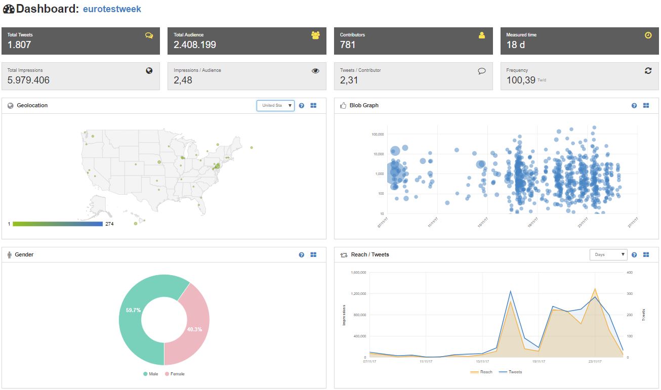
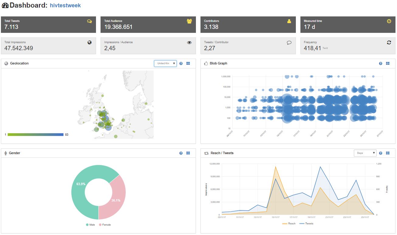
- Geographical maps of tweeters/ retweeters using the Followthehashtag website: to look at spread of the message across the world (limit typically 1,500 tweets so will only be able to capture snapshots of larger campaigns).
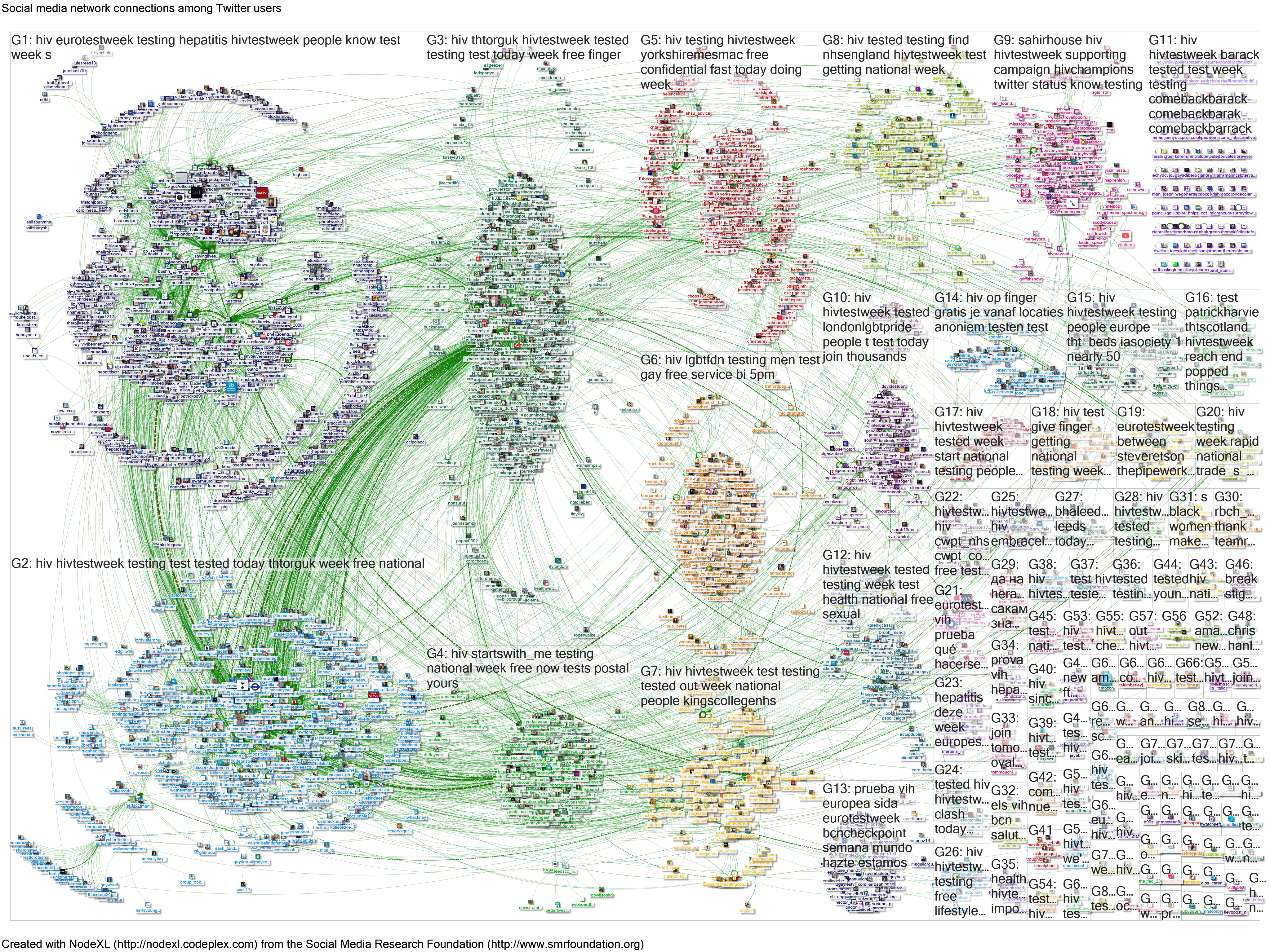
- Social network analysis using NodeXL, looking at connections (people tweeting using the hashtags, retweeting or replying to these tweets, or mentioned in the tweets). This tool extracts up to 18,000 tweets and it is possible to combine extracts to look at longer period.
- Summarising top content using my “top tweets” analysis of NodeXL extracts – see examples of this approach on my Storify page.
I have used this approach in other public health campaigns including World Antibiotic Awareness Week most recently (13-19 November 2017), and data extracted ready for analysis for World Diabetes Day (14 November 2017). Obtaining a complete extract is not a straightforward process, with access to Twitter rather like a garden hose on full blast with a bunch of people dancing about around it – sometimes people step on the hose and the flow reduces to a trickle; other times it’s like a geyser catching everyone. During busy periods – eg the start of a campaign, or the flurry of activity that comes with celebrity endorsement – it is sometimes only possible to access a few minutes of tweets, which makes social network analysis of limited use. I have back up options that can provide social network analysis but are a little more fiddly to use for the “top tweets” analysis (eg TAGS tool).
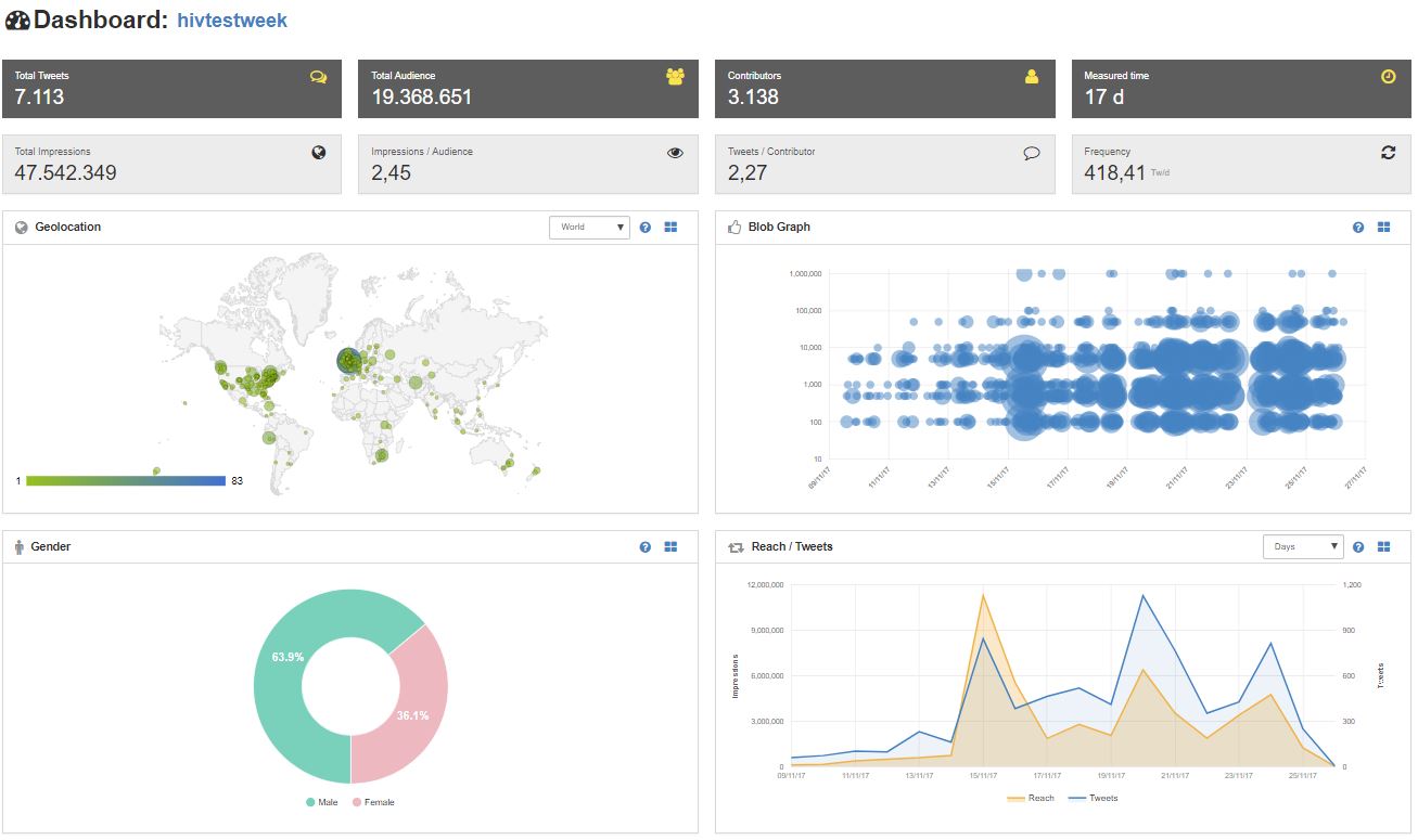
The following statistics show impressive international reach: mainly in Europe for EuroTestWeek, but interest elsewhere too; wider reach for the HIVTestWeek campaign. The summary of top content (Storify pages) shows greater diversity of posts for the EuroTestWeek campaign; for HIVTestWeek many of the top posts featured the posters, with their clear and striking images of individuals representing different test groups. There was some further testing using accessory hashtags (eg TestTreatPrevent and Time2Test but most of these tweets also included either the EuroTestWeek or HIVTestWeek so are included in the analysis presented below).
| #EuroTestWeek (notes at end of this blog) | #HIVTestWeek (notes at end of this blog) | |
| 1) Basic numbers (complete) | 18 days 1,807 “tweets”(i) 781 contributors(ii) 6.0m impressions(iii) 2.4m audience(iii)60% men: 40% women |
17 days 7,113 tweets(i) 3,138 contributors(ii) 47.5m impressions(iii) 19.4m audience(iii)64% men: 36% women |
| 2) Geographical maps (complete)
(Click maps to see in more detail; source FollowTheHashtag website) |
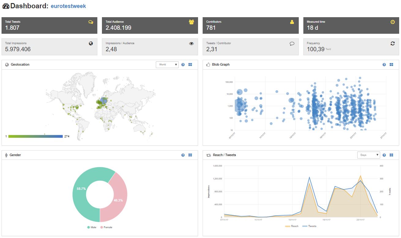   
|
   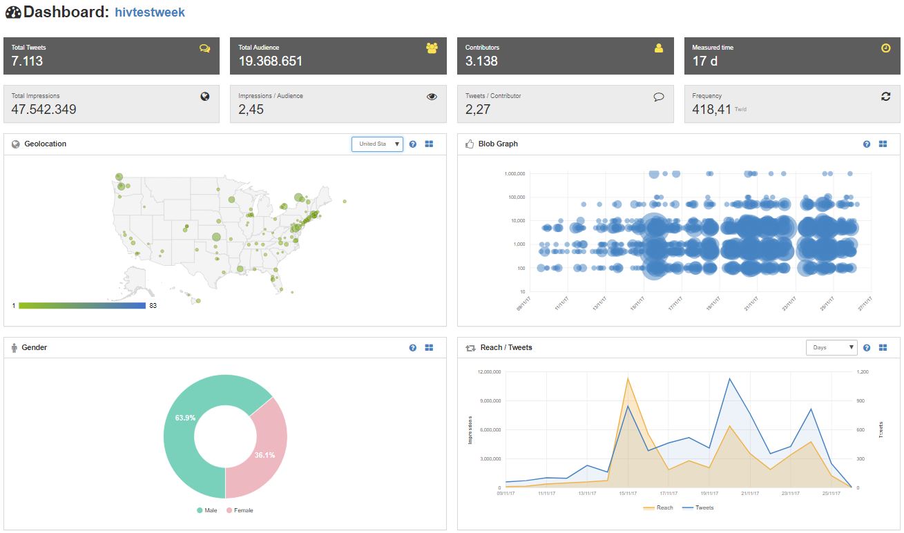
|
| 3) Social network analysis (click map or link for more detail) |
|
|
| 4) Top tweets analysis (via Storify) | I initially tried to run a combined analysis of both hashtags to produce an ongoing summary here.
In fact it has proved simpler to look at the campaigns separately. Here is the link to the EuroTestWeek summary (at least 5 retweets) |
Summary of HIVTestWeek (at least 10 retweets on busy days, at least 5 retweets on quiet days) |

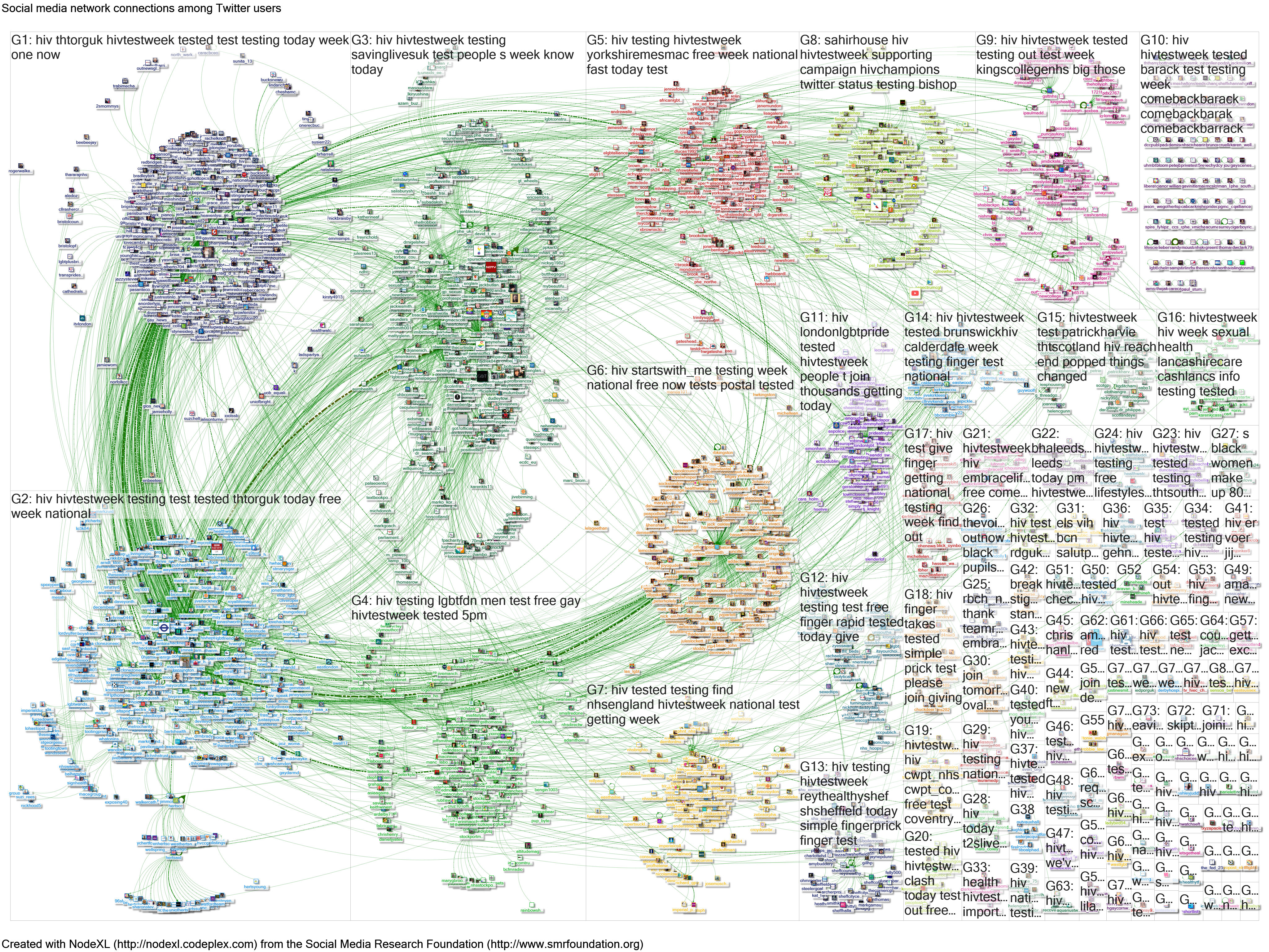
A NodeXL graph for the two campaigns (EuroTestWeek or HIVTestWeek) together is shown below (full report here):
This is a quick summary – full data are available at the links above and I would be interested to hear what colleagues discover in further analysis. Hopefully this information will be of interest ahead of World AIDS Day on Friday 1 December. I will be attempting a similar analysis of that campaign, but the sheer scale (9,000 tweets per hour in the extract I was able to obtain last year) will mean that I will be resorting to different approaches to capture a full record of tweets.
Dr Graham Mackenzie, Consultant in Public Health, NHS Lothian, originally posted 18 November 2017, completed 29 November.

Featured image is from HIV Prevention England website.
Notes: i) “Tweets” here = tweets, replies and retweets, though full “FollowTheHashtag” report provides breakdown under these three headings).
ii) Contributors = tweeters and retweeters
iii) Likely to be a considerable overestimate – see earlier blog.

Grayham, thank you absolutely Brilliant , informative , and generous of time , those of us trying to raise awareness via twitter have spent many many hours getting it wrong , and then accidentally getting it right
LikeLike
Thanks Steve, it’s a pleasure. I’ll update during the week. Speak to you along the way, Graham
LikeLike