
Quality Improvement (QI) is a powerful approach for exploring and improving the way that healthcare is delivered. However, the technical terms surrounding the methodology can make QI seem inaccessible. This is a pity, as many of the techniques will be familiar to clinicians through their routine work. QI work is simply about making refinements to the way we work, one patient at a time, building a more reliable process, and keeping our sights on a bigger goal.
This blog explains some of the key principles and approaches of QI work, stripped of its jargon, using 4 common objects as an aide-memoire. The formal QI tools on which these objects are based are listed in the notes section at the end of this blog.
If you’d prefer a video summary then you can find a version here (Youtube).
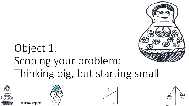
Object 1) Nested Russian dolls (scoping the problem)
When we set out to improve a service we will often start at too high a level – the whole service, a major disease pathway, all patients, all staff. A politician might think at a whole country level. While such an ambition might be the ultimate plan over a period of many years, these whole service aims will lead to inertia unless we think at a smaller level. They are often referred to as “world peace” projects.
The nested Russian dolls below show how we can work from a “world peace” project to an idea that we can test for our next clinic. The aims, measures and ideas to test are simple at the stage of the smallest doll, allowing for immediate testing.(1)
Starting with “world peace” we have moved to an area under our immediate influence – the appointments process at an antenatal clinic. We are now ready to move on to testing, so scroll down for object 2 after watching the animation.
Object 2) A lamp (testing… for light bulb moments)
The next object is chosen for two reasons. First, it is shaped like the Swiss army knife of QI work – the Model for Improvement(2). Second, it is a reminder of the initial purpose of the testing – searching out light bulb moments. We have an aim, measures and ideas to test from object 1. We place these in the top half of the Model for Improvement. The lower half of the model takes us round the PDSA cycle. The acronym PDSA stands for plan and predict, do, study, act.
We run a sequence of PDSA cycles, helping us to refine our approach and gather information. Through the course of testing we realise that some parts of our process are not working as planned or predicted. We also work out ways to improve, testing these in a variety of circumstances. Eventually, however, we will run out of ideas to test, and will need to move on to object 3 (scroll down).

Object 3) Tally sheet/ garden gate (generating ideas, pushing on open doors)
The process of generating ideas requires imagination and lateral thinking. However, the actual approach is low tech – all you require is people (staff and/or patients), a process and pen and paper (the “4 Ps” perhaps).
Asking people for their thoughts – for example in a questionnaire, suggestion box, or focus group – allows you to count up and rank people’s ideas using a tally sheet. Theme the responses if you get free text responses. This approach means you can use qualitative data to prioritise ideas.

In the example from the antenatal clinic above the staff are stuck at the point of the application process for Healthy Start vouchers. Healthy Start vouchers, for low income families, are worth £3.10 a week. Vouchers can be used to buy fruit, vegetables, milk and formula feed. They are a good place to start for this work because midwives are able to sign the application form and the pregnant women should have access to all the necessary information to complete the form. Completing an application is within the immediate control of a pregnant woman and her midwife. Receiving the vouchers, however, is more complex because it requires eligibility checks by Department of Work and Pensions/ Her Majesty’s Revenue and Customs.
Staff ask the pregnant women why they are struggling with their applications. Their responses are ranked in decreasing order (not real data: solely for illustrative purposes). This information gives staff ideas for the next stage of their testing.

We can use this information to draw up a Pareto chart(3), but that may be a stumbling block for some teams if they do not have the necessary analytical skills. Don’t worry though: focusing on the biggest categories is enough to start you off. The dual purpose of object 3 is to remind us that we need to start with ideas that are common enough to allow rapid testing, and where people are keen to engage (push on open gates).

Object 4) Scales (to balance measures, and a reminder to avoid judgement)

Inevitably, QI work involves measurement. The scales selected as object 4 remind us that we need to look at a balanced picture. The scales remind us – thinking of the scales of justice – that QI work is never about judgement, and always about learning.
Examples of measures in different contexts include:
- process measures (eg clinic attendance, time to being seen)
- outcome measures (eg value of previously unclaimed benefits secured, birth weight, child development milestones, blood pressure control, healthcare acquired infections)
- and balancing measures (eg hours worked per day, staff absence)
In the example below the % of women receiving Healthy Start vouchers (right) has increased. However staff are working harder (phoning reminders, collecting new data, worrying about lost applications) and the staff absence rate has increased (left). We don’t want to break the system, so it will be important to pause and reflect on what we have learnt. QI methods have given us the evidence for what could work, but also the potential resource implications.
While there are a series of rules to learn when plotting data over time(4) the general approach – plotting measures against time – just needs some planning, a piece of squared paper and a pen.
Conclusions
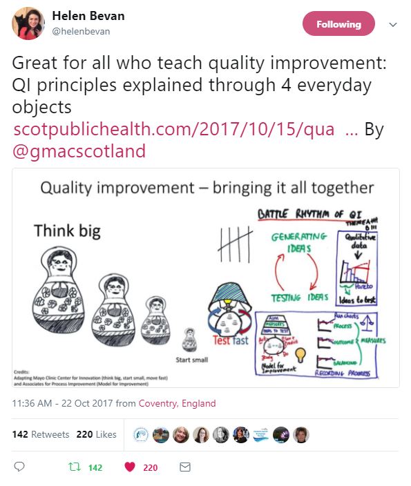
This blog has used 4 objects to introduce concepts in quality improvement work.
Here are the objects in a visual summary: first, think big, but start small, and test fast.
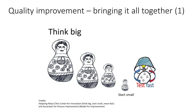
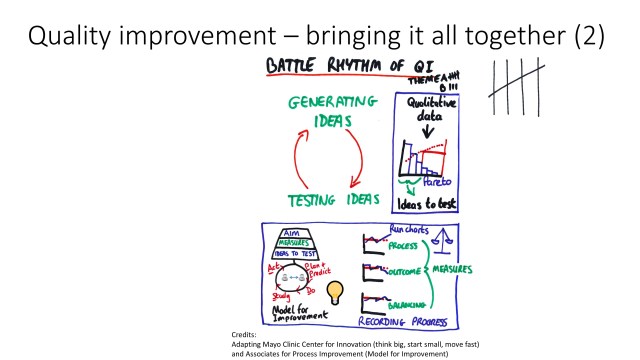
And second, remember to keep generating as well as testing ideas, measuring as you go.
The blog has summarised some points that may be useful to more seasoned quality improvement workers:
- The term “ideas to test” is probably more useful than “change ideas”: it sounds less permanent
- Remember that the P in PDSA = “Plan and predict“
- If Pareto charts are a stumbling block, start simply by ranking the categories from biggest to smallest, and focus on the ideas where your team has influence
- Similarly, if run chart rules get people in a tangle, encourage them to simply chart data over time – you can introduce the run chart rules as you go along.
You can read a more detailed analysis of work on the Healthy Start scheme and welfare rights advice in Lothian in BMJ Open Quality.
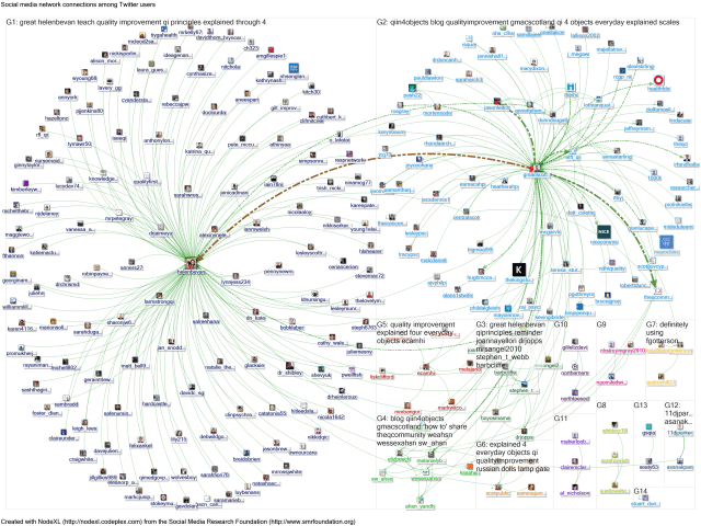
If you have found this blog helpful, or have comments, then please tweet using #QIin4Objects. I will map the tweets about this blog using social network analysis. I plan to present the findings at the Q Community national event at Aintree (23 November 2017). You can see the slides from that event here.
Dr Graham Mackenzie, Consultant in Public Health, NHS Lothian, 15 October 2017

Here are some metrics around this blog:
A NodeXL map showing 9 days of tweets around the blog
A Followthehashtag analysis of impressions and geographical reach:


Views of the blog (via WordPress): 
Some feedback (click image to go to tweet):


Notes and further references
- The QI tool that serves the same purpose as the Russian dolls is a “driver diagram” (and a “nested driver diagram” when the ideas are initially too big). The Institute for Healthcare Improvement (IHI) website has films showing how to use a driver diagram.
- Read more about the Model for Improvement in the 1000 Lives Wales Quality Improvement Guide. The developers of the Model for Improvement – Associates in Process Improvement – discuss driver diagrams and the model for improvement in more detail.
- Pareto chart: using the 80:20 rule. Read more from East London Foundation Trust and IHI.

- Read more about plotting data over time (run charts) in the 1000 Lives Wales Quality Improvement Guide. More advanced techniques (statistical process control charts) are covered by the East London Foundation Trust.

Fabulous blog Graham are you happy for me to reference and use in my coaching
LikeLike
Thanks Barbara,
Very happy for you to do so. Please could you credit me if using in slides etc (by adding @gmacscotland)?
Good luck and happy to discuss.
Kind regards,
Graham
LikeLike
Pingback: Increasing the quality and impact of Public Health tweeting – looking beyond #ScotPublicHealth – #ScotPublicHealth
Pingback: Some thoughts on digital innovations in Public Health – #ScotPublicHealth
Pingback: Communication in a complex world – perspectives for Public Health/ NHS teams – #ScotPublicHealth